
PA District 4 Congressional Map
Background
Pennsylania recently went through a redistricting process. This is important for Montgomery County because District 4 is very similar in shape to the county. There’s a bit cut out, and there’s a bit of Berks County included.
Download the PDF, suitable for printing at 36×27″Who this map is for
The archetype for this map is someone running for Congress who needs a quick visual reference but doesn’t need too much detail.
What this map shows
- Congressional Districts to Counties
- Municipalities to the 4th District, with a 2 mile grid and road base
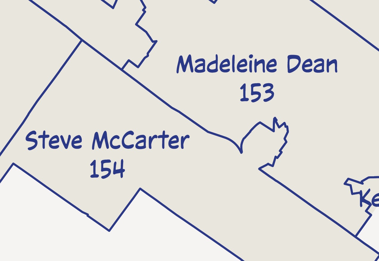
- State House districts to the 4th District
The main map includes Census TIGER roads and water (most of which is cut out)
Grid and mask
I generalized the grid to two mile squares, where a scale of 1:62,000 = a mile. That’s not a perfect match, so I manually created the grid. The border needed to match up with the grid that covers the map.
To mask data outside of the border, I used a complex object to create a mask.
Erie County
Erie County always bugs me because it goes way up into Lake Erie. The PennDOT County data shows the coast and Presque Isle on this map. I left both.
Layering
Grid, boundaries, roads, and road symbols all needed to be layered. While you’d be able to see the roads better if I placed the municipal boundaries beneath them, it looked ugly. I think I used a multiply opacity.
I placed the grid just above the roads and beneath the road text.
Muncipal outlines
Municipalities import into the map as polygons. There are a couple of ways I could handle this. I guess I could have just stylized the layer instead of stylizing the individual lines. I chose to use the pathfinder-outline tool because in this instance it makes clipping at the edges of the Congressional district easier.
I just duplicated the municipality layer before using the outline tool so that I wouldn’t lose the attributes.
In the earlier draft, the width for municipalities was 5 points. Then I revised this to 3 points.
Info I chose not to show
I chose to only showed numbered roads (3 digit numbers): State, US and Interstate. I modified the data, removing “State Rte. ” from each state route field. This made drawing icons easier. This could also have been done a couple of other ways.
Route icons
The route icons are fonts. Multiple fonts can make up a single icon, and they are colored and combined using a .lsf file that looks something like this:
[Symbol 1]
TTFFileName=/Library/Fonts/hwysym.ttf
BMPFileName=us_route.png
SymbolName=US Route
NumGlyphs=2
Glyph 1=48 RGB 255 255 254
Glyph 2=47 RGB 0 0 0
TextBox=-0.35,-0.25,0.35,0.25
There’s not good documentation for this, so I may make a post about creating these fonts. If I had just used QGIS, I would have used svg symbols.
The text for labels seems to be left justified. I wish I could also use center justified.
Layout
I chose to set this up and lay it out in Illustrator using MAPublisher. The idea was that it could be laid on a table beneath a sheet of glass. I was thinking about 48“x36”. But then this seemed excessive. I ended up printing several copies at 36“x27”, about 70% the original size.
I started off by adding Montgomery County and a small state map in the lower left. When I went to add the PA House Districts onto the main map, they conflicted with the core message of the map. So, I added a third map to the layout.
Printing
I printed copies on photo paper and on Tyvek (for durability). The poster setting on my plotter provides the best color regardless of the paper.
Fonts
I mostly stuck with Minion for titles and Myriad Pro. For a little relief, I used a ComicCraft font called CCVictorySpeechLower and made the labels dark blue.
Text placement
I’m never completely happy with the automated text placement even though it’s a timesaving tool. I placed text one layer at a time, and I didn’t save the text layer styling for future use. It would have been a good idea.
Alternatively, I could have placed multiple text layers similtaneously. I went through and moved text. While not automated, it only took a few minutes. I wonder if this would have been a good use for creating an action.
Color/Hue
Most of the focus was muted colors. The border is reminiscent of the Fairfax County Bike Map that I did last year. All of the colors, except for the blue and black are very light.
Border
The border is a linear graphic style. I drew a rectangle and then curved the corners. To get the grids to line up, I clipped each line near the corners and used some guides to snap to.
Final thoughts
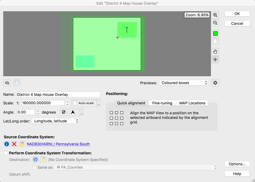
I made this map in Illustrator with MAPublisher. If I were to do this in QGIS first, with final touchup in Illustrator, I probably would have made three versions and placed them into the Illustrator artboard.
In this case, working in MAPublisher let me move maps and rescale quickly. In the green area of the graphic, you can see the three boxes. These represent each map.
Now it’s time to get back to work…